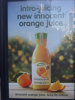
It's all too easy to get bogged down in analysing advertising given the investment of time, money and reputation that it represents. I'm not always sure what good it does and I'm far from certain that non-marketing professionals ever do that - unless of course we foolishly ask them to do so in focus groups.
But I'm going to do it anyway because this ad from a company close to my heart has appeared everywhere. Can you see what grabbed my attention? It's the small i in innocent, juxtaposed with the capital J in juicy in the line at the bottom - a design conceit that means that the start of both sentences is different and, to me, visually jarring.
Designers rightly talk about fonts being important - but what's the point if simple consistency is overlooked? In the great scheme of things, it probably doesn't matter. It's unlikely to stop people from buying juice, but it irritated me and I wonder if I am not alone in that.